📌Achievement Goals
CSS Intro
- CSS의 의미를 이해한다. ✅
- 현업에서 자주 사용한는 CSS를 알아본다.✅
- 변수의 선언과 값의 할당에 대해서 설명하고 코드로 작성할 수 있다. ✅
- 값으로 변환된 표현문이 변수에 할당되어 담기는 과정을 설명할 수 있다. ✅
변수 기초, 변수 실습
- 자바 스크립트에서 변수의 선언과 값의 할당에 대해 설명할 수 있다. ✅
- 변수 선언과 값 할당에 사용되는 용어에 대해 정확하게 알 수 있다. ✅
- =가 '같다' 라는 의미가 아니라 할당 연산자 임을 이해할 수 있다. ✅
- num = num + 1이 '같다' 라는 의미가 아니라 값을 할당하는 것 임을 설명할 수 있다. ✅
📌Chapter Contents
CSS Intro
- CSS란: Cascading Style Sheet의 약자로 Cascading의 사전적인 의미는 작은 폭포로
- 예를 들어 스타일링을 작성한 문서가 있고 브라우저에서 기본적으로 제공해 주는 UI가 있는데 이때 버튼을 만든다고 가정할 때 "정의한 style sheet에 Styling이 있는지 확인합니다."
- 만약 정의한 style sheet이 없다고 하면 브라우저에서 기본적으로 제공해 주는 style sheet에서 가져오게 됩니다.
CSS의 문법
| Universal | * |
| type | Tag(ex div,header,section) |
| ID | #id |
| Class | .className |
| State | : |
| Attribute | [] |
selector{ property: value;} 어떠한 selector(tag)를 골루고 내가 꾸미고 싶은 property를 선택 후 value를 줍니다.
자주 사용하는 CSS
flex box
flex box는 크게 두가지만 생각하면 된다.
- Container와 Item입니다. Container에 적용할 수 있는 Atrribute와 Item에 적용할 수 있는 Atrribute가 있습니다.
Container
- display
- flex-direction
- flex-wrap
- flex-flow
- justify-content
- align-items
- align-content
Item
- order
- flex-grow
- flex-shrink
- flex
- align-self
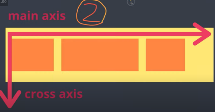
2. main axis와 cross axis
📌flex-direction
- display: flex; inline or block depending on the given value. It enables a flex context for all its direct children.
- flex-direction This establishes the main-axis, thus defining the direction flex items are placed in the flex container.
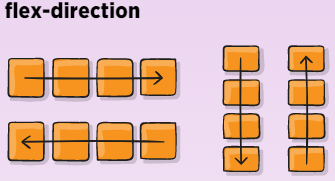
row: left to right
row-reverse: right to left
column: top to bottom
column-reverse: bottom to top
- flex-wrap: item들이 container의 크기를 넘어가면 자연스럽게 다음줄로 넘어가도록 합니다.
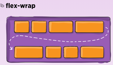
nowrap(default): all flex items will be on one line.
wrap: flex items will wrap onto multiple lines from top to bottom.
wrap-reverse: flex items will wrap onto multiple lines from bottom to top.
- flex-flow: flex-direction + flex-wrap
- justify-content: 주축을 따라 정렬합니다. 한줄의 모든 플렉스 항목이 유연하지 못하거나 유연하지만 최대 크기에 도달했을 때 남는 여유 공간을 분배합니다.
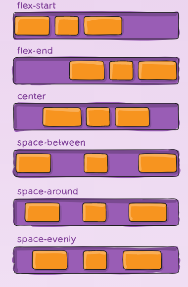
flex-start: items are packed toward the start of the flex-direction.
flex-end: items are packed toward the end of the flex-direction.
center: items are centered along the line.
space-between: items are evenly distributed in the line.
space-around: items are evenly distributed in the line with equal space around them.
space-evenly: items are istributed so that the spacing between any two items is equal.
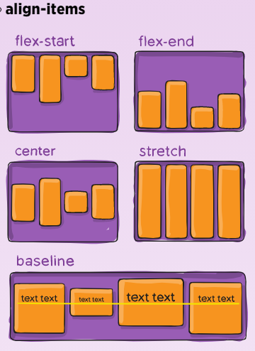
- align-items: 선의 교차 축을 따라 플렉스 항목을 배치하는 방법을 정의합니다.
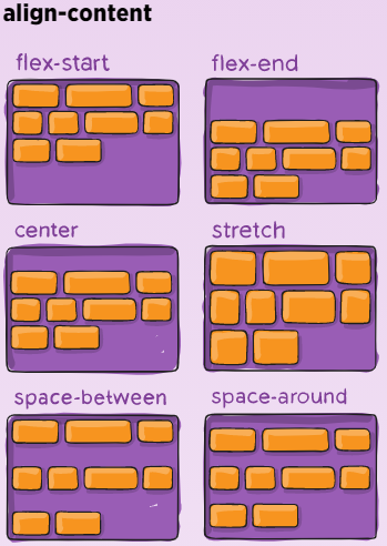
- align-content: 플렉서블한 컨테이너이만 적용되며 단일 선 플렉서블 컨테이너에는 적용되지 않습니다.
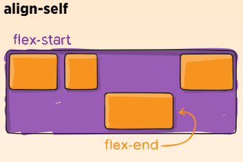
- align-self: 개별 플렉스 항목에 대해 기본 정렬을 재정의할 수 있습니다.
'프론트엔드 > HTML & CSS' 카테고리의 다른 글
| WebAPIs(브라우저 좌표) (0) | 2021.08.28 |
|---|---|
| CSS(정렬) (0) | 2021.08.28 |
| CSS(Responsive web) (0) | 2021.08.28 |
| CSS(Media query, Animation (0) | 2021.08.28 |
| HTML의 기초 (0) | 2021.08.27 |