728x90
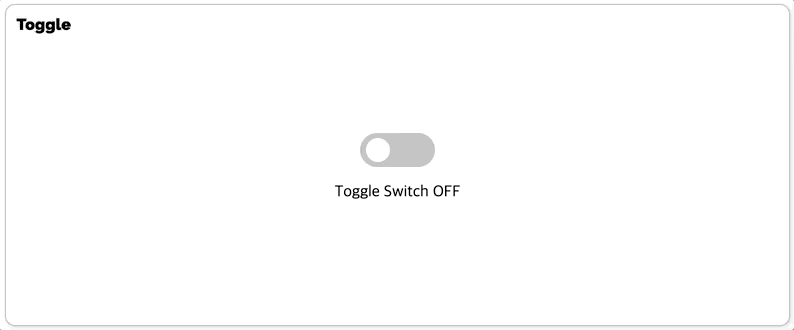
Toggle UI 컴포넌트는 두 가지 상태만을 가지고 있는 스위치입니다. 예를 들어, 한번 누르면 불이 들어오고 한번 누르면 불이 나가는 스위치를 Toggle Switch 라고 할 수 있습니다.
import { useRef, useState } from 'react'
import styled from 'styled-components'

// TODO: Styled-Component 라이브러리를 활용해 여러분만의 tag 를 자유롭게 꾸며 보세요!

export const TagsInput = styled.div`
  margin: 8rem auto;
  display: flex;
  align-items: flex-start;
  flex-wrap: wrap;
  min-height: 48px;
  width: 480px;
  padding: 0 8px;
  border: 1px solid rgb(214, 216, 218);
  border-radius: 6px;
  > ul {
    display: flex;
    flex-wrap: wrap;
    padding: 0;
    margin: 8px 0 0 0;
    > .tag {
      width: auto;
      height: 32px;
      display: flex;
      align-items: center;
      justify-content: center;
      color: #fff;
      padding: 0 8px;
      font-size: 14px;
      list-style: none;
      border-radius: 6px;
      margin: 0 8px 8px 0;
      background: #4000c7;
      > .tag-close-icon {
        display: block;
        width: 16px;
        height: 16px;
        line-height: 16px;
        text-align: center;
        font-size: 14px;
        margin-left: 8px;
        color: #4000c7;
        border-radius: 50%;
        background: #fff;
        cursor: pointer;
      }
    }
  }
  > input {
    flex: 1;
    border: none;
    height: 46px;
    font-size: 14px;
    padding: 4px 0 0 0;
    :focus {
      outline: transparent;
    }
  }
  &:focus-within {
    border: 1px solid #4000c7;
  }
`

export const Tag = () => {
  const initialTags = ['CodeStates', 'kimcoding']
  const inputRef = useRef('')

  const [tags, setTags] = useState(initialTags)
  const removeTags = indexToRemove => {
    // TODO : 태그를 삭제하는 메소드를 완성하세요.
    setTags(
      tags.filter(tag => {
        return tag !== tags[indexToRemove]
      })
    )
  }

  const addTags = event => {
    // TODO : tags 배열에 새로운 태그를 추가하는 메소드를 완성하세요.
    // 이 메소드는 태그 추가 외에도 아래 3 가지 기능을 수행할 수 있어야 합니다.
    // - 이미 입력되어 있는 태그인지 검사하여 이미 있는 태그라면 추가하지 말기
    // - 아무것도 입력하지 않은 채 Enter 키 입력시 메소드 실행하지 말기
    // - 태그가 추가되면 input 창 비우기
    let value = inputRef.current.value
    if (event.key === 'Enter' && !tags.includes(value) && value) {
      setTags([...tags, value])
      inputRef.current.value = ''
    } else if (event.key === 'Enter' && !value) {
      inputRef.current.value = ''
    }
  }

  return (
    <>
      <TagsInput>
        <ul id="tags">
          {tags.map((tag, index) => (
            <li key={index} className="tag">
              <span className="tag-title">{tag}</span>
              <span
                className="tag-close-icon"
                onClick={() => removeTags(index)}
              >
                {/* TODO :  tag-close-icon이 tag-title 오른쪽에 x 로 표시되도록 하고,
                            삭제 아이콘을 click 했을 때 removeTags 메소드가 실행되어야 합니다. */}
              </span>
            </li>
          ))}
        </ul>
        <input
          ref={inputRef}
          className="tag-input"
          type="text"
          onKeyUp={e => {
            {
              /* 키보드의 Enter 키에 의해 addTags 메소드가 실행되어야 합니다. */
            }
            addTags(e)
          }}
          placeholder="Press enter to add tags"
        />
      </TagsInput>
    </>
  )
}
728x90
'스프린트 > react-custom-component' 카테고리의 다른 글
| react-custom-component tag (0) | 2021.11.01 |
|---|---|
| React Custom Component Tab (0) | 2021.11.01 |
| React Custom Component Modal (0) | 2021.11.01 |